Brand
Creative direction
Real moments between real people. ASL is an ordinary part of social life, and the brand is the facilitator, never the hero.
The look, before the brief
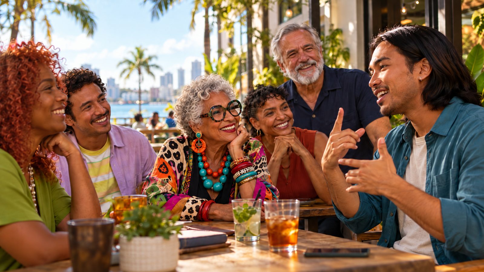
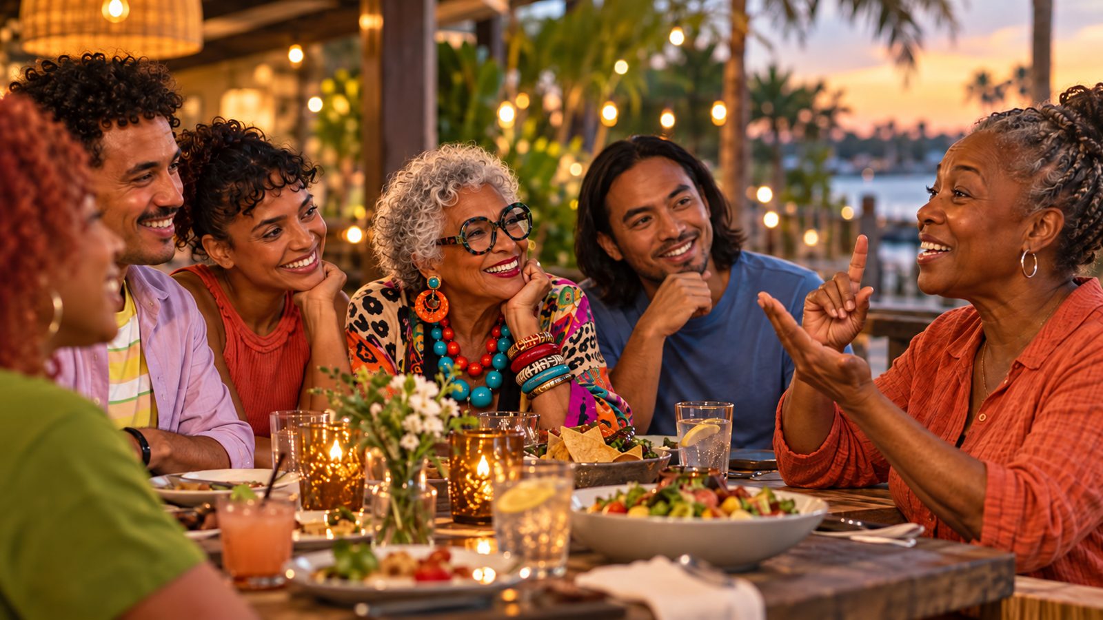
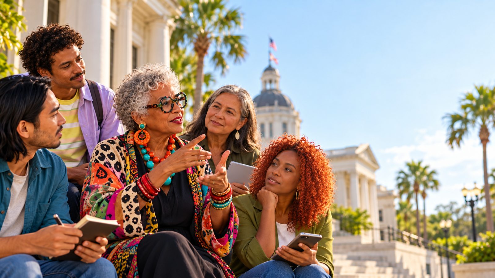
A pull from the live photo seam (lib/photos.ts) — the one real, credited photograph plus stand-ins already in use across the site — each one illustrating a rule from the sections below.



The core idea
Create media centered on real human connection between Deaf people and hearing people, expressed naturally through American Sign Language and visual communication, with warmth, humor, sophistication, and emotional honesty.
The work should feel cinematic, contemporary, intimate, observational, culturally aware, and genuinely human.
Strangers become connected
People who begin as strangers gradually become comfortable, curious, amused, and connected.
Not tragedy, inspiration, limitation or spectacle
Deafness is not presented as tragedy, inspiration, limitation, or spectacle.
ASL is ordinary
ASL is treated as a natural language and an ordinary part of social life.
Deaf people at the center
Hearing people take part in these moments; they are not the frame around them. This keeps the direction consistent with the Deaf-led principle on the Positioning page.
Casting
Show a genuinely diverse mix of people:
- Deaf adults
- Ages approximately 20s through 70s
- Black, white, Latino, Asian, Middle Eastern, Indigenous, and multiracial people
- Men, women, nonbinary, and gender-diverse people
- Varied body types
- Varied hairstyles and personal styles
- Visible age diversity
Diversity must feel organic rather than staged or tokenized.
Older people should participate fully in the social energy, humor, and conversation rather than appearing as background representation.
Everyone should feel specific, individual, contemporary, and believable.
ASL and Deaf culture on screen
When showing American Sign Language:
- Preserve clear eye contact.
- Keep faces and hands visible.
- Show natural visual turn-taking.
- Include expressive facial grammar.
- Show natural pauses and reactions.
- Show people visually listening.
- Allow conversational overlap.
- Show genuine laughter and social rhythm.
- Never crop signing hands unnecessarily.
- Avoid using isolated hands as decorative imagery.
- ASL should always feel like communication between people, not a symbolic visual effect.
- Do not fabricate written translations unless explicitly requested.
- When linguistic accuracy matters, prioritize Deaf talent and Deaf or ASL creative consultation.
Emotional tone
Warm. Intelligent. Social. Funny. Slightly imperfect. Observational. Unforced. Stylish without becoming glossy.
Emotion should emerge from behavior rather than exaggerated performance. Use:
- Glances
- Pauses
- Hesitation
- Recognition
- Shared jokes
- Subtle awkwardness
- Spontaneous laughter
- People leaning toward each other
- Small gestures of comfort and familiarity
Avoid:
- Exaggerated commercial smiling
- Sentimentality
- Inspirational disability narratives
- Pity
- “Overcoming adversity” framing
- Portraying Deaf people as extraordinary merely because they are communicating or participating socially
Visual world
Favor sophisticated, intimate, real-world environments. For example:
- Neighborhood restaurants
- Cafés
- Bars
- Homes
- Cultural spaces
- Parks
- Galleries
- Workplaces
- Community spaces
- City streets
- Gatherings
Environments should feel lived-in rather than staged. Include natural signs of life:
- Partially eaten food
- Glasses
- Personal objects
- Coats
- Bags
- Menus
- Imperfect table settings
- Background activity
- Reflections
- Practical light sources
Lighting
Use naturalistic, motivated lighting. Favor:
- Warm practical lights
- Soft window light
- Subtle directional light
- Gentle contrast
- Rich skin tones
- Soft shadows
- Realistic falloff
- Practical lamps and environmental light sources
For warm evening interiors, favor approximately 2700K to 3200K practical lighting. Keep all complexions accurate and dimensional.
Avoid:
- Flat corporate lighting
- Harsh beauty lighting
- Excessive HDR
- Artificial glow effects
- Aggressive orange-and-teal grading
Color in photography and film
Prefer warm, grounded, tactile colors:
- Amber
- Honey
- Cream
- Walnut
- Caramel
- Bronze
- Terracotta
- Muted olive
- Burgundy
- Charcoal
- Black
- Natural skin tones
Keep saturation restrained and sophisticated. Blacks should feel rich but retain detail. Highlights should roll off softly.
This is the grade for photography and film. It is separate from the interface palettes of the two directions, and images are never tinted with either direction's interface colors. How each direction sits beside it:
| Direction | Sits well with the grade | Clashes with it | Beside photographs |
|---|---|---|---|
| Sunrise | Ten of fourteen colors: Cream, White, Butter, Wheat, Sand, Marigold, Bronze, Taupe, Ink and Deep Plum (a warm burgundy). | Dusty Teal and Warm Rose sit outside the grade. Mist is a cool tint. | Cream, Butter, Sand, Marigold and Ink. Keep teal and rose for chips and illustration, away from photo edges. |
| Art Deco | Seven of fifteen: Dark Velvet, Velvet Green, Champagne, Blush, Gold Foil, Burnt Orange and Orange Glaze. Most of the rest read as dark charcoal-green. | Celery is an acid yellow-green outside the grade. Sage and Seafoam are cool greens. Dark green beside orange reads as the orange-and-teal look this direction says to avoid. | Dark Velvet grounds with Champagne, Blush and Gold Foil. Keep Celery and Orange Glaze to small accents, never image tints or overlays. |
Measured against reference values for the named colors: amber #D9962B, honey #D9A441, cream #F3E8D0, walnut #5A3E2B, caramel #B9773A, bronze #9A6B2F, terracotta #B8563A, muted olive #6E6B3B, burgundy #6B1E2E, charcoal #33373A, black #0E0E0E and four skin tones, #F1C9A5, #C68642, #8D5524 and #5C3A21. A color within 12 of one of them counts as sitting well.
Photography and cinematography
Visual language should feel like an excellent documentary photographer or cinematographer is physically present inside the experience. Favor:
- Seated eye-level perspectives
- 35mm and 50mm equivalent lenses
- Occasional 85mm portraits
- Medium shots
- Two-shots
- Three-shots
- Group compositions
- Over-the-shoulder framing
- Foreground depth
- Candid reactions
- Asymmetrical composition
Use shallow depth of field carefully. Multiple participants should remain readable when they are communicating together.
Avoid:
- Excessive extreme close-ups during signing
- Sterile symmetry
- Fashion-editorial posing unless explicitly requested
Shot briefs for the prototype's photo slots
The prototype's photo slots are filled. The 50th Biennial has a real photograph, "Mid-signing outdoors" by Gritchelle Fallesgon, from the disability-led Disabled And Here collection (CC BY 4.0, credited in the footer). The other slots hold stand-in images until real photography from FAD events replaces them, and a slot with no image shows one of these scenes. Cast and shoot with Deaf talent and Deaf or ASL creative consultation, as above.
| Scene | Framing | Light |
|---|---|---|
| Café table | Two-shot, seated eye level, 35mm. Both faces and hands in frame, a shared joke landing. | Soft window light with warm practicals |
| Neighborhood bar | Three-shot around a table, 35mm. Overlapping conversation, someone leaning in. | Warm practicals, roughly 2700K to 3200K |
| Kitchen table at home | Medium two-shot over the shoulder, 50mm. Coffee cups and coats in the foreground. | Window light and a table lamp |
| Park gathering | Group composition, 35mm. People laughing between signs, no one posed. | Open shade, late afternoon |
| Gallery or cultural space | Medium shot, two people beside a work. Asymmetrical composition, hands clear of the frame edge. | Gallery spots with soft falloff |
| Workplace | Over-the-shoulder, 50mm. A colleague reacts as someone signs. | Daylight from a window plus desk lamps |
| City street corner | Two-shot on a stoop or corner, 50mm. Life moving behind them. | Overcast daylight, gentle contrast |
| Community hall | Medium group shot at an event. People visually listening to a signer. | Practical hall lights plus daylight |
Motion
For video and animation:
- Restrained handheld camera
- Slow organic push-ins
- Subtle reframing
- Natural pans between participants
- Observational camera movement
- Realistic motion blur
- Approximately 24 fps cinematic motion when appropriate
Avoid:
- Excessive gimbal movement
- Sweeping drone-like motion
- Unnecessary slow motion
- Artificial camera tricks
- Flashy transitions that overpower the people
Motion should feel motivated by attention. The camera moves because a person reacts, begins signing, laughs, or draws focus.
Image texture
Aim for premium contemporary image-making with subtle analog character:
- Natural skin texture
- Fine grain
- Slight optical softness
- Gentle halation
- Realistic dynamic range
- Authentic exposure
Avoid:
- Plastic skin
- Excessive sharpening
- AI-perfect faces
- Over-retouching
- Exaggerated bokeh
Writing and copy
Copy should be concise, intelligent, warm, confident, conversational, and culturally respectful.
Avoid explaining Deafness unless the content specifically requires education. Avoid inspirational slogans about overcoming limitations.
The words to avoid and the language to prefer are listed on the Voice and messaging page.
By channel
Rules for short-form social, print and out-of-home, web and digital, and audio are on the Applications page. The one rule that holds everywhere: never cover signing hands or faces with text, UI, subtitles, logos, stickers, or CTA overlays.
Brand behavior
The brand should feel like a facilitator of connection rather than the hero.
- People come first.
- Product, service, logo, or CTA comes second.
- Avoid turning people into proof points for the brand.
- Brand presence should feel confident enough not to interrupt the moment.
Accessibility is part of the direction
Accessibility is part of the creative direction, not an afterthought. Ensure:
- Signing remains visually unobstructed.
- Captions are accurate.
- Text has sufficient contrast.
- Typography is readable.
- Essential meaning is not audio-only.
- Essential meaning is not color-only.
- Interfaces are usable without relying solely on sound.
What to avoid
Do not create:
- Disability clichés
- Pity narratives
- “Inspirational Deaf person” tropes
- Staged diversity
- Corporate stock-photo behavior
- Exaggerated commercial smiles
- Artificial emotional manipulation
- Random hand gestures pretending to be ASL
- Cropped signing hands
- Excessive visual effects
- Hyper-polished luxury advertising unless specifically required
- Melodramatic music
- Token representation
The final work should feel social, specific, contemporary, inclusive, funny, intimate, visually beautiful, and emotionally honest.
Master prompt
The complete prompt, for briefing photographers, film crews, editors and generative tools. The sections above are the same direction, organized by topic.
Show the full master prompt
MASTER CREATIVE DIRECTION PROMPT
Create media centered on real human connection between Deaf people and hearing people, expressed naturally through American Sign Language and visual communication, with warmth, humor, sophistication, and emotional honesty.
The work should feel cinematic, contemporary, intimate, observational, culturally aware, and genuinely human.
The core emotional idea is:
People who begin as strangers gradually become comfortable, curious, amused, and connected.
Deafness is not presented as tragedy, inspiration, limitation, or spectacle. ASL is treated as a natural language and an ordinary part of social life.
CASTING
Show a genuinely diverse mix of people:
- Deaf adults
- ages approximately 20s through 70s
- Black, white, Latino, Asian, Middle Eastern, Indigenous, and multiracial people
- men, women, nonbinary, and gender-diverse people
- varied body types
- varied hairstyles and personal styles
- visible age diversity
Diversity must feel organic rather than staged or tokenized.
Older people should participate fully in the social energy, humor, and conversation rather than appearing as background representation.
Everyone should feel specific, individual, contemporary, and believable.
ASL AND DEAF CULTURE
When showing American Sign Language:
- preserve clear eye contact
- keep faces and hands visible
- show natural visual turn-taking
- include expressive facial grammar
- show natural pauses and reactions
- show people visually listening
- allow conversational overlap
- show genuine laughter and social rhythm
Never crop signing hands unnecessarily.
Avoid using isolated hands as decorative imagery.
ASL should always feel like communication between people, not a symbolic visual effect.
Do not fabricate written translations unless explicitly requested.
When linguistic accuracy matters, prioritize Deaf talent and Deaf or ASL creative consultation.
EMOTIONAL TONE
Warm.
Intelligent.
Social.
Funny.
Slightly imperfect.
Observational.
Unforced.
Stylish without becoming glossy.
Emotion should emerge from behavior rather than exaggerated performance.
Use:
- glances
- pauses
- hesitation
- recognition
- shared jokes
- subtle awkwardness
- spontaneous laughter
- people leaning toward each other
- small gestures of comfort and familiarity
Avoid exaggerated commercial smiling.
Avoid sentimentality.
Avoid inspirational disability narratives.
Avoid pity.
Avoid “overcoming adversity” framing.
Avoid portraying Deaf people as extraordinary merely because they are communicating or participating socially.
VISUAL WORLD
Favor sophisticated, intimate, real-world environments.
Examples:
- neighborhood restaurants
- cafés
- bars
- homes
- cultural spaces
- parks
- galleries
- workplaces
- community spaces
- city streets
- gatherings
Environments should feel lived-in rather than staged.
Include natural signs of life:
- partially eaten food
- glasses
- personal objects
- coats
- bags
- menus
- imperfect table settings
- background activity
- reflections
- practical light sources
LIGHTING
Use naturalistic, motivated lighting.
Favor:
- warm practical lights
- soft window light
- subtle directional light
- gentle contrast
- rich skin tones
- soft shadows
- realistic falloff
- practical lamps and environmental light sources
For warm evening interiors, favor approximately 2700K–3200K practical lighting.
Keep all complexions accurate and dimensional.
Avoid:
- flat corporate lighting
- harsh beauty lighting
- excessive HDR
- artificial glow effects
- aggressive orange-and-teal grading
COLOR PALETTE
Prefer warm, grounded, tactile colors:
- amber
- honey
- cream
- walnut
- caramel
- bronze
- terracotta
- muted olive
- burgundy
- charcoal
- black
- natural skin tones
Keep saturation restrained and sophisticated.
Blacks should feel rich but retain detail.
Highlights should roll off softly.
PHOTOGRAPHY / CINEMATOGRAPHY
Visual language should feel like an excellent documentary photographer or cinematographer is physically present inside the experience.
Favor:
- seated eye-level perspectives
- 35mm and 50mm equivalent lenses
- occasional 85mm portraits
- medium shots
- two-shots
- three-shots
- group compositions
- over-the-shoulder framing
- foreground depth
- candid reactions
- asymmetrical composition
Use shallow depth of field carefully.
Multiple participants should remain readable when they are communicating together.
Avoid excessive extreme close-ups during signing.
Avoid sterile symmetry.
Avoid fashion-editorial posing unless explicitly requested.
MOTION
For video and animation:
- restrained handheld camera
- slow organic push-ins
- subtle reframing
- natural pans between participants
- observational camera movement
- realistic motion blur
- approximately 24 fps cinematic motion when appropriate
Avoid:
- excessive gimbal movement
- sweeping drone-like motion
- unnecessary slow motion
- artificial camera tricks
- flashy transitions that overpower the people
Motion should feel motivated by attention.
The camera moves because a person reacts, begins signing, laughs, or draws focus.
IMAGE TEXTURE
Aim for premium contemporary image-making with subtle analog character:
- natural skin texture
- fine grain
- slight optical softness
- gentle halation
- realistic dynamic range
- authentic exposure
Avoid:
- plastic skin
- excessive sharpening
- AI-perfect faces
- over-retouching
- exaggerated bokeh
WRITING AND COPY
Copy should be:
- concise
- intelligent
- warm
- confident
- conversational
- culturally respectful
Avoid explaining Deafness unless the content specifically requires education.
Avoid inspirational slogans about overcoming limitations.
Avoid language such as:
- “despite being Deaf”
- “hearing impaired”
- “overcoming silence”
- “finding their voice”
- “breaking barriers” unless literally relevant
Prefer language about:
- meeting
- belonging
- curiosity
- conversation
- laughter
- connection
- shared experience
- unexpected chemistry
SOCIAL CONTENT
For short-form social:
Lead with a human moment rather than branding.
Prioritize:
- immediate eye contact
- a signed joke
- laughter
- a surprising reaction
- a small moment of chemistry
Keep pacing natural but efficient.
Captions should be readable, restrained, and secondary to the people.
Do not cover signing hands or faces with text, UI, subtitles, logos, stickers, or CTA overlays.
PRINT / OOH
Use strong human interaction rather than isolated portraits whenever possible.
Choose moments that communicate relationship visually:
- eye contact
- hands mid-sign
- laughter
- attentive listening
- shared expressions
Leave sufficient negative space for messaging.
Never place typography over signing hands or important facial expressions.
WEB / DIGITAL
Let visual storytelling lead.
Favor:
- large immersive photography
- restrained typography
- generous spacing
- subtle motion
- accessible contrast
- readable captions
- strong keyboard accessibility
- proper semantic structure
Video should not depend on audio to communicate its essential meaning.
Avoid clutter that competes visually with signing.
AUDIO
When sound is used, keep it natural and secondary to the visual interaction.
Possible elements:
- room tone
- laughter
- table sounds
- clothing movement
- environmental ambience
- understated music
Do not add unnecessary spoken dialogue to scenes where the participants are communicating through ASL.
Music should support emotion without manufacturing sentiment.
BRAND BEHAVIOR
The brand should feel like a facilitator of connection rather than the hero.
People come first.
Product, service, logo, or CTA comes second.
Avoid turning people into proof points for the brand.
Brand presence should feel confident enough not to interrupt the moment.
ACCESSIBILITY
Accessibility is part of the creative direction, not an afterthought.
Ensure:
- signing remains visually unobstructed
- captions are accurate
- text has sufficient contrast
- typography is readable
- essential meaning is not audio-only
- essential meaning is not color-only
- interfaces are usable without relying solely on sound
AVOID
Do not create:
- disability clichés
- pity narratives
- “inspirational Deaf person” tropes
- staged diversity
- corporate stock-photo behavior
- exaggerated commercial smiles
- artificial emotional manipulation
- random hand gestures pretending to be ASL
- cropped signing hands
- excessive visual effects
- hyper-polished luxury advertising unless specifically required
- melodramatic music
- token representation
CORE CREATIVE TEST
Every piece of media should feel as though the audience has entered a real moment between real people.
The viewer should think:
“I want to be there.”
Not:
“Someone is trying to teach me a lesson.”
The final work should feel social, specific, contemporary, inclusive, funny, intimate, visually beautiful, and emotionally honest.