Design system
The FAD brand book
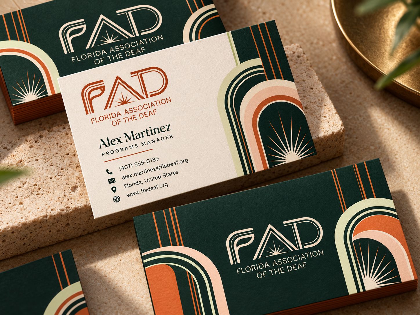
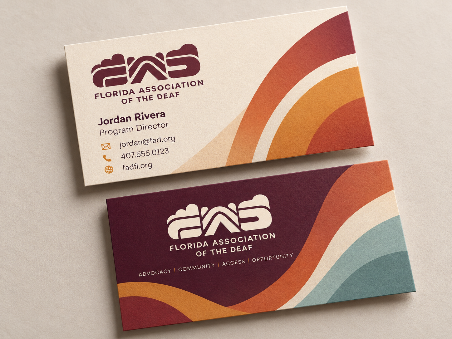
Who FAD is, how it sounds, how it looks and what it must never do. Art Deco and Sunrise are shown side by side as options; neither has been chosen, and the logo is a placeholder.
Brand
PositioningDraft
The contemporary visual voice of Florida's Deaf community. A statewide Deaf advocacy association, founded in 1917, renewing itself.
Voice and messagingDraft
Direct, warm and proud. We say what people are owed and what to do about it.
LogoDraft
Each direction has its own wordmark, drawn in one colour from a single file. The other variants are gray placeholders until they are drawn, and no final direction has been chosen.
Imagery and iconography
Real people, Deaf-led, in real Florida light. No stock clichés.
Deaf culture and ASL
The identity should be recognized as Deaf-led before anything else.
Creative direction
Real moments between real people. ASL is an ordinary part of social life, and the brand is the facilitator, never the hero.
ApplicationsDraft
Where the identity has to work: shirts, bags, banners, cards, signs, flyers and the web.



Foundations
Color
Two directions, shown side by side. Ratios below are measured live from the CSS variables.
- AaAa
Typography
Eight sizes. Each direction sets its own display voice over the same body face.
Space, shape and motion
One spacing scale, two shape languages, short purposeful motion.
Accessibility
WCAG 2.2 AA is the floor. Deaf-first, DeafBlind-aware is the bar.